The Psychology Behind Colors: What They Mean And Their Effect
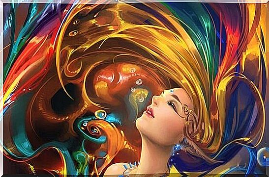
Talking about the psychology behind colors is the same as talking about emotions. It is a language that can evoke pleasure, joy, restlessness, energy.
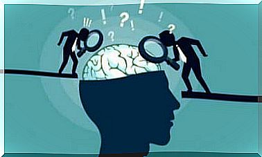
It’s more than marketing. Colors have roots in personal experiences, in our childhood and in symbolism that science and psychology try to find out.
Claude Monet used to say that the world of color was his daily obsession, his joy – but also his torment. If it is not easy for an artist to capture the finesse of every shade and color combination, then it is difficult to define how each color affects people and their behavior.
In fact, some people see it as pseudoscience, and there is some truth in that. Because one thing we do know is that color has a lot to do with personal taste, experiences, upbringing and even cultural differences.
But, this is perhaps the most interesting of all, there are many studies that explain how people react to certain colors and that talk about which ones are the most popular.
One of the most interesting books on this is “The psychology behind colors: how colors affect emotions and logic” written by psychologist, sociologist and professor of communication theory Eva Heller.
This book is the result of several years of research, research and observations that ended with interesting data that coincides with various studies conducted both before and after her.
Maybe not surprising, but one conclusion is: the most popular color on average, is blue.
The psychology behind colors: what is the purpose of them?
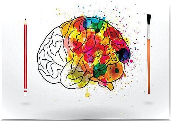
Colors stimulate our brain in several different ways. In fact, in the past, Egyptians and Chinese used to connect the effect of color with the idea of healing, which encourages some states of consciousness and feeling.
For example, red for Egyptians was a reflection of the life, land, victory and anger of enemy gods such as Set and Apep.
Color is more than just an optical phenomenon. Everyone has their own meaning. Everyone has a specific influence on our brain and therefore the psychology behind colors is an essential tool in neuromarketing.
Understanding how consumers respond to certain color stimuli can lead to higher sales. Although this is not 100% fairly consistent, we can see similar patterns of reactions that show us that the psychology behind color is usable.
At the same time, we must not forget the effect color has on the world of art and image. David Lynch , for example, is a director obsessed with leaving the world of logic by immersing himself in the fine kaleidoscope of emotions.
And in his productions he uses the contrast between black and white because, according to him, it symbolizes the escape from reality to dreamland.
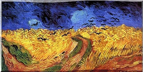
Van Gogh also used colors to express his feelings, leaving stronger shades of yellow and blue to add color to his fields and starry skies.
What each beautiful means and its characteristics
Now, let’s look at the psychology behind colors. We will look mostly at the research that Dr. Eva Heller performed in her book, while we will look at current research by psychologist and Stanford professor Jennifer Aaker. She recently wrote an analysis of color used in the world of neuromarketing.
Blue
- Blue is the most widely used color in offices and businesses because of how productive and unobtrusive it is.
- It is a color that promotes a sense of faith and trust in a brand.
- It has been proven that blue inhibits people’s appetite and should therefore not be used in food marketing.
- It is the color of harmony, fidelity and sympathy.
- It is the coldest color, but it is still associated with spirituality and imagination.
- There are 111 shades of blue.
- It is a primary color, and for artists the most popular shade of blue was “sea blue”. It was the most expensive, but it made the paintings more vivid.
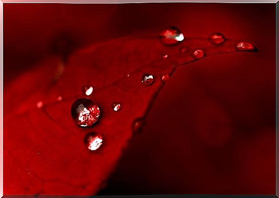
Red
- Red is also one of the most widely used colors in marketing: it differs from the rest of the colors, is appealing and is used to attract attention.
- It increases people’s heart rate and creates a feeling of urgency, danger or instantaneous.
- Red is used to stimulate appetite and encourage impulsive buying.
- It represents love at the same time as hatred.
- Red is the color of king, joy and danger.
- It represents blood and life.
- It is a dynamic, seductive color that can awaken our most aggressive side.
Yellow
- In marketing, it represents optimism and youthfulness.
- It represents clarity and is often used to bring attention to certain products on the shelf.
- It should not be used too much since it is a tiring color to look at. Therefore, it is usually used more on outer shelves than on the central shelves.
- Some studies show that deep yellow shades make babies cry.
- For the experts who work with the psychology behind colors, yellow is a contradictory subject: it represents both evil and good, optimism and jealousy, understanding and betrayal.
- Yellow illustrates and favors creativity.
- It is a masculine color and in China it was a sign of royalty.
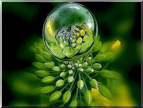
Green
- Green is the color of development, renewal and rebirth.
- It is associated with health, nature, freshness and peace.
- It helps with problem solving and encourages freedom, healing and peace.
- Dark green represents money, economic issues and citizenship.
- There are also more than 100 different shades of green, where in the middle they are mood enhancers.
- It also represents future love.
- Green is a color that helps us relax. In fact, this color is very helpful for people suffering from depression.
Black
- Black is often associated with elegance, secrecy, mysteries and power.
- It evokes strong emotions and is a color that shows authority.
- In the world of fashion, it is stylish and sophisticated.
- There are 50 shades of black.
- It symbolizes the end of something: death, loss.
- In the past it represented priests and now it is a symbol of conservative people.
- In the world of physics, black absorbs 100% of light and does not reflect anything from the spectrum. Therefore, throughout history, blacks have been associated with danger and evil.
White
- In the psychology behind colors, white symbolizes innocence and purity.
- It represents beginnings, the will to start something new.
- White brings openness and honesty to a place, while at the same time bringing a sense of peace, healing and tranquility.
- It is associated with perfection.
- There are 67 shades of white.
- A white collar symbolizes status.
Purple
- In marketing, beauty and anti-aging products often use purple.
- It’s soothing.
- Many brands use it to represent creativity, imagination and wisdom.
- Purple and femininity, magic and spirituality go together.
- There are 41 shades of purple.
- When we use it too much, it leads to ambivalence: experts advise against painting an entire room in this color.
- Purple symbolizes power, but also ambiguity.
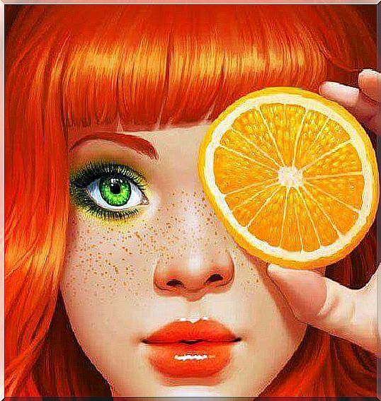
Orange
- In marketing, this is associated with enthusiastic shopping and it reflects emotion and warmth.
- However, if an intense color is used, it may be associated with aggression. Therefore, the tones must be soft, cozy, comfortable and friendly.
- It is the favorite in the world of advertising because it encourages buying.
- It is associated with transformation and Buddhism.
- Orange not only triggers positive emotions, but it also generates “taste”.
Pink
- Pink symbolizes charm and courtesy.
- In marketing, consumers associate pink with children and romance.
- It is the shade of erotic tenderness.
- Pink symbolizes that which is sweet, childish and small.
- It was Madame de Popmadour’s favorite color.
Maybe you do not agree with these descriptions – or maybe you are. As we mentioned at the beginning, the effect of each color can change depending on our experiences. But commercially and artistically, these basic descriptions are useful and effective.
There are other colors that are not on this list such as brown, gold, silver and gray. We have limited the list to the most influential colors. Those who the world of art and neuromarketing use the most – and without our knowledge – those who influence us.